It Takes Two to Tango: Integrating UX Research and Production at EA
Posted in Conferences - Events, Game Session, Research on March 10th, 2017 by Veronica Zammitto – Be the first to commentHere are the slides and delivery from my talk at GDC 2017 on UX Research and Production integration at Electronic Arts.
I use dancing tango as the metaphor through out this presentation. Â It’s about the relationship between production and research. I describe how we learnt to dance together.
When you start learning how to dance, you are not good at it. You step into toes, one goes to one side the other to another side. The two dancers are going to make mistakes.
Like in dancing, you are constantly moving when developing games. There is not time to stop, things keep coming. It takes practice to get good at it.
You might be wondering how these dancers met.
User Experience has been gaining a lot of traction over the last years within the game industry, we could say it is one of the newest aspects within game development. For instance, it was only at GDC’s 29th iteration when there was for the first time a dedicated UX Summit. That alone is very telling.
Yet, UX as a concept was coined in the 90’s, and actually the beginning of usability evaluation goes all the way back to the 40’s. So, there has been a long history on measuring and assessing users experience on a variety of products.
Particularly for games, ‘playtesting’ has been done for a long time, however such concept has been used in a variety of ways and generally without the framework of research. I’ll dive more in depth about this distinction later on.
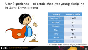
Nowadays every major developer has dedicated UX Research employees. I surveyed these numbers mid-2016 and sort them out alphabetically. Notice some of them are quite sizable, it could be the equivalent to development team in itself!
Moreover, as the understanding of players matures related disciplines are consolidated within larger departments; as it is in the case of Electronic Arts, Riot, and Ubisoft where games user research, market research, analytics, and data science are part of an internal larger organization.
However, during the advent of UX research into the game development, production might have been seen research as a disruption to their already established process, while UX researchers were still adapting methods and vocabulary for game development context.
That disruption took many shapes, from production not seeing the need for research to production wanted to have it but not knowing how to action on findings.
Mind you it was also on research learning how to convey UX findings in a timely manner for production and how to communicate such findings to be meaningful and actionable. This is part of the story that I’m going to tell you today.
When UX research and Design are not fully synchronized, it leads to missing key UX opportunities. Opportunities doesn’t mean that we have to do a major overhaul, opportunities are within production’s limitations (of time, of budget, of scope, or technology).
Over my last 7 years at EA that I’ve had the opportunity of working on fantastic games in our portfolio. What follows is sharing the stories on how we have tackled UX Research and Production integration at Electronic Arts.
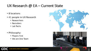
A small spoiler alert, after the whole story, this is where UX Research is now at EA:
We are sizeable team. Geographically distributed across 8 locations world wide.
At EA we have three prototypical roles within the UX Research team: Researcher, Recruiters, and Lab techs.
Depending on the size of the company, all of these roles can be carried out by different people or all of them by a single person. The latter happens more often in smaller companies, or in early stages of UX research teams.
That was actually my case, back in the day when starting UX Research at EA, I had to do the recruitment for my own sessions, while designing the study AND setting up the lab. Lots of juggling! Imagine that each task was a time suck for doing the other. And it’s not that these tasks have to go in a hard sequential order. It was very exhausting and not efficient.
Across EA we have some guiding philosophies, the most important piece is the player. Everyhing we do has players at the forefront.
We also aspire to work as One Team. Across studios, across team, between research and production, it’s one
All this might sound great, but it was not always like that, nor it was without bumps on the road and misalignments first. So, how did we get there?
Well, first and foremost, we didn’t get there overnight. It was a multiyear journey, and sincerely is a path that will never end 🙂 As the UX practice, the industry, and products evolve, we will evolve as part of it.
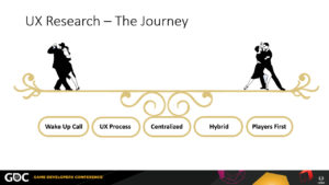
This is the journey with key milestone we went through, with examples and lessons learnt on the main aspects that shaped thriving an integrated UX practice
It starts rough. It starts with the “Wake Up Callâ€
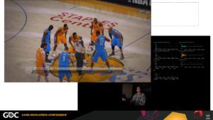
Back in in 2009, NBA Elite was being developed. Improving UX was a huge driver for that team, there were high expectations for this game. Introducing brand new controls and mechanics to innovate the genre. It was meant to reboot the NBA Live franchise.
Consequently the team was rather self-critical about the quality of the UX data and how actionable it was. At the time ‘playtesting’ was a part the development process however it was led by designers/producers who self taught themselves usability testing, and even though they had the best good intentions, they could ‘smell’ their research could be different and better J and that was the seed for starting to transform ‘playtesting’ to ‘UX Research’.
In 2010, we started initiatives for new approaches to evaluate NBA with players, bringing that edge of science.
For this, I went super tech and brought “more advanced†techniques than what it was being done at the time for playtesting: eye tracking, biometrics and telemetry all at once! I assessed players’ visual attention, their emotional valence, and tracked their in-game behaviors. It was awesome 🙂  The idea behind it was to tap into insights that the surveys being used couldn’t get. The efforts was to give the most we could to NBA for understanding the player experience.
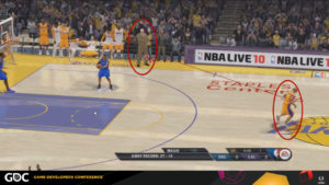
A particular fascinating finding was that all players consistently looked at the coach after making a basket. Bear in mind that the coach did nothing on screen, there was not special animation, no voice over, or anything that could lead to him. This was an unexpected result which pointed out a missed opportunity for positive reinforcement for making a basket. This insight never appeared on other techniques.
I was getting insights that were completely new and were supporting the needed deep assessment of players experience. But all this ‘marvelous’ type of work was new which meant the process for data collection, analysis, and feedback was very slow. Any action items for those findings had to be left for the next installment.
Time was passing by and the team needed to focus on finishing the game. NBA Elite was coming hot.
As it is common, there was a demo scheduled and released to the public. During this talked I showed a some snippets from a viral video from a player playing the demo.
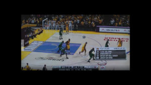
There were friction points related to the UI, to the core mechanics. There was also the infamous Jesus Bynum glitch.
This demo was a nail in the coffin. NBA Elite never ended up being released.
It was deemed that it didn’t reach the desired quality, that players would be disappointed and that the best decision (even after the game was fully ‘done’) was to not release it. It was an extremely hard decision. I can’t stress enough how much of a shock this was for everyone.
It was a wake up call.
As a video game company, it was very clear that quality process needed to be better.
I wouldn’t go as far to say that better UX research would have been the silver bullet to all problems, but definitely clearer and more iterative UX check points needed to be there. With that the new UX research initiatives were a business case to bring it to the next level. Yet the price for that wake up call was extremely high.
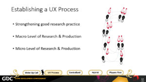
There was work to be done. We needed to improve the research practice from its foundations. Even though biometric techniques proved to be very insightful, we needed to change focus from advancing methodologies to establishing a UX process.
We needed quality research in an iterative process where production and research are fully synchronized. That means having a plan, knowing your steps.
We tackled this problem from three different angles:
- Strengthening Good Research Practice
- Macro Level of Research & Production Framework
- Micro Level of Research & Production Integration
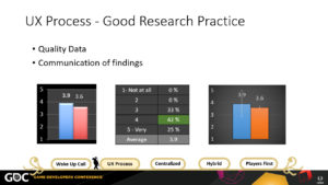
Regarding the basic good research practice, there were immediate aspects to address. Such as data quality, things like ensuring wording of questions in surveys are clean and not leading. These efforts were towards researchers’ skills. The goal was to have quality data, so we can be certain on the research findings and also to have trust. Trust from Production that they don’t need to double check data, they don’t need to go over data point themselves. Trust is a corner stone for any relationship.
Ultimately we do research to communicate its findings. Like in tango communication has to be clear and timely, because we are constantly moving. You don’t want your partner to go into one direction and you to the other. Or accidentally stepping on toes.
I’ll share one example on this topic. You all have seen research data coming in the form of the typical question answered in a scale from 1 to 5. All players data is aggregated and presented in a bar chart like this, which is ok to know how good or bad things are going. However, it is not sufficient when you want to prioritize resources in production.
Particularly in cases when you have more than just one or two comparison. In games like PvZ Garden Warfare, where there are more than 40 characters to choose from. Production wants to make sure that all of them are hitting the mark, and if not to focus on those first. This was exactly one of the questions the production team had.
Looking into how to communicate findings, we did some tables like this to see the spread of responses. Even though the game team was happy because there was the needed piece of information, it can get hard to read.
That’s why confidence intervals are part of our good research practice for communicating findings. Confidence intervals is one way of representing variability in players’ responses which allows to spot meaningful differences. It keeps the simplicity yet adds a richer insight.
In this case with a target score of 3.5, the orange option is reaching the mark tightly, however, the blue option at first seemed as a strong was actually inconsistent with polarized answers, being a bigger risk, and gaining the prioritization from production.
Confidence intervals became part of the basic good practice of doing research.
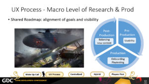
Now at a macro level, at EA we have a game development framework which all games developed at EA have to follow. In a simplified way, it is pretty much the default stages of development that are common across the industry (pre-pro, production, release), which is applicable to everyone in this room.
The value of stopping and getting intimately familiar with the dev process framework is for UX research to really understand where their efforts are at the different stages, what the biggest challenges are, what the dev team is asked by execs to keep advancing. This information brings clarity on common misconceptions like readiness of production and how they prioritize. And vice versa, how research activities are aligned to best impact UX efforts. I added a few prototypical task in the chart.
Ultimately, the framework serves as a map for production and UX to navigate together what is needed, when it’s needed, and what the impact is.
Sharing a framework is also a common language
For UX Research at EA, in order to be part of the development process, we needed to articulate how and what value we were bring to the table. So we worked out an extension of that development framework to laid out all prototypical research endeavors at each of those stages.
From there we were able to work with production to further tailor UX questions based on specific game characteristics and design intentions.
For example, in Battelfield 1 a key design intention was being Epic. We make explicit what was supporting that feeling of epicness throughout development: Being a FPS in World War 1, weapons had to feel ‘old school’ and authentic yet not to the detriment of slowing down players actions. Another example was the introduction of large vehicles, like the zeppelin. We answered questions related to the impact of introducing these behemoths vehicles during a full match.
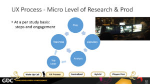
Having that UX Roadmap where both production and UX are aligned for what needs to happen is key. But then, we need to execute it. So, let’s look at the micro level and with this I‘m referring to what needs to happen for each study. A default test can be divided into four steps: preparation, execution, analysis, and reporting. It informs production, action on findings, and on to the next iteration.
We were doing fairly well having production on kick off meetings for each test and they will come to the observation room for the tests. But between analysis and reporting, we experienced a couple errors until landing onto our current standards.
At first, we were so eager to provide them with the best analysis possible that it took up to 2 weeks to deliver a report. By that time production had already make changes to the game and most of the findings were not applicable any more. It was a mistake forgetting production keeps moving, they will not pause to wait for your results. It was also generating anxiety to production not knowing what happened for so long.
Even more production started taking their own notes from what they saw in the test and start auctioning on that. Which is a high risk of running with no representative data.
We needed to fix this! We did try as well super turn around of a report within 2 days, but that ended up being more of a ‘data dump’ than analysis.
The middle ground agreement was adding to the UX research process the 1-day turn around for top liner, which contains the high level analysis from the test, with a final report 2-4 days later depending on scope. This helped greatly on our communication, in providing timely information to production to keep moving. It help the relationship as well by addressing their needs.
At EA a default study takes in average 2 weeks from kick off to final report. We found that this turn around fit best based on how fast content advances.
Pro tip: ideally that 2 weeks window for research aligns well with production sprints!
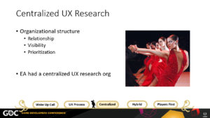
Now that the UX Process is laid out, I want to focus on ‘organizational structure for UX Research’. With this I’m referring to “where within the company should UX Researchers liveâ€.
Organizational structures have implications on relationship among individuals, the visibility those individuals have on products, and allocation of effort which impacts prioritization.
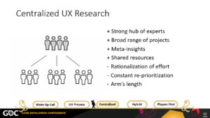
At EA we had a centralized UX research organizational structure. We engaged with multiple game teams across all of EA, and as you know they EA portfolio is pretty large. In other words, a single team with a handful of researchers carried out all the research activities across the whole organization was. This means that the researcher was not part of the game team and that the researcher supported multiple teams. For example, a researcher worked on FIFA as well as on UFC and NHL.
This type of organizational model was great for us at the time. Remember that we had that ‘wake up’ call? That we needed to set good processes? This org model is great for that.
There are four positive aspects of having UX research centralized:
- this organizational model forges a strong, tight hub of experts. This allows for easier sharing of best practices ensuring research quality. This was the most important aspect for us at that time to mature our practice.
- the range of projects and tasks tends to be more varied. This is more refreshing for researchers in the long term and can assist in retaining talent.
- the accumulation of knowledge across multiple projects and multiple researchers is a great situation that allows leverage learnings from one project to another. Identifying meta-insights that can answer bigger business questions. [For example, beyond Battlefield we can look at Battlefront and aim to answer questions for shooters games that are more complex.]
- the economic benefits of centralized teams primarily manifest though shared resources. Why? Because eliminates duplication of effort and equipment. For example, lab space, internal recruiter, or software licenses
For us with a focus on better processes and consistency was a structure that made a lot of sense.
We were also just handful of people on UX research and we needed to cover a lot of games. With that there are also some challenges in central teams.
- the rationalization of effort among all projects. One researcher covering 3 different games is still only one person.
- this leads to a permanent re-prioritization exercise. You don’t need to have a huge portfolio for facing this challenge. I’m sure all of you can relate to that. Even within a single game the same logic applies, for example the need to prioritize features and modes within a game. This is a delicate overall topic that leadership in any company needs to address because it has direct implications on the vision for the products and the morale of the teams.
- another shortcoming of a centralized structure is that the relationship with production tends to be more at arm’s length. The development team can perceive the researcher as an external agent or even the researcher feeling outside of the project. A factors that contributes to this effect is the rapid development cycles where a project can radically change over the course of a week. It emphasizes being ‘out’ of the loop, being outside of the team. Of course an experienced researcher leverages on relationship and can stay on top of projects but this does not fully overcome the absence of further engagement or attention.
At EA, research efforts were paying off and had great supporters. It enabled growing the size of the team, allowing researchers to focus on one project at a time for most cases. For example, one researcher has his full time for FIFA, another her full dedication to Battlefront, and so on.
This was fantastic for us to have more bandwidth, but getting more headcount for more researchers is not a light task, as in any organization it’s not something that just growths on trees.
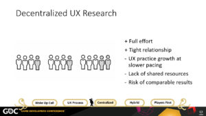
We evaluated a decentralized model where researchers are independent from each other, they are part of a development team and they can fully dedicate their efforts to that one project.
However, we concluded that slower pacing for improving UX processes, an increased cost of resources, and more critical the risk of lacking comparable results was not worth it.
The researcher’s output would be overseen by team members in production who are likely to lack research expertise to properly monitor quality. That’s almost like asking for another wake up call. Plus it would increase the workload to production to do research instead of advancing design.
We wanted quality. We wanted people to know how to dance properly, not just shaking your body in some way.
By now we had established better, stronger relationships between production and research. We had identified our champions within the teams, worked with them to iron processes, UX roadmaps. Things had improved since that Wake Up Call.
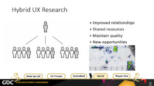
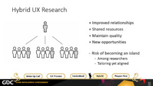
One day, one of our key PoC for NHL decided to move on to another project which left a void into our syncs. Instead of waiting for the NHL team to backfill that role. We took that as an opportunity to step up our game and propose to the team to go ‘embedded’ with them.
In other words, that the UX Researcher working with NHL would now sit in with the rest of the dev team and be reintroduced as a team member rather than a partner. Even though, the researcher would remain as part of the UX Research team as well, therefore it wouldn’t be for NHL to manage the research or having to provide any extra support (no extra overhead, no extra costs)
The NHL team was very supportive of the proposal and gladly assigned the ‘desk space’ on their floor to the researcher. It sounds silly how something so little as the location of a desk could have a huge impact on mindset, but it really help to have deeper relationship with production. It’s a bit like “out sight, out of mindâ€, and now were where right with them 24/7. Communication got to a new level, those ‘snags’ were less and less often. Designers asked more questions to the researcher, more continues discussions on actioning on findings.
The fact that we had a researcher embedded also meant better adjustment of research questions while running at full steam during development, and the researcher has more opportunities to expand on different research skillsets. For example, for NHL there was a lot of work being done on updating the user interface, on top of making it usable, it was tested for color blind players.
Because we had by know a strong foundation and process, we are now able to ‘go back’ and start advancing on more advanced methodologies.
A challenge that we are dealing with is maintaining the relationship between central and embedded researchers, and supporting tailored strategies while still keeping alignment with general processes. Which is where we are now at EA with a large number of researchers scatter across multiple locations. We aim to have synchronous and asynchronous communication, from video conferencing, to mailing list, to slack, and IMs.
We went from the emphasis on solid research, to deeper relationship, and now it’s how do we keep the balance between the two.
An approach we are employing now is to encourage internal projects to foment dialog among researchers. For instance, critically review the best questions to ask for weapon variety across all shooters. Or, new and effective ways to assess narrative which can cross multiple game genres.
Such internal projects are great for meta-insights and to ensure our practices is updated. If anyone has been facing similar challenges, I’d love to talk to you on how you’ve been tackling in your organization.
What I’ve told you so far was related to ‘grass root’ efforts. A lot of change for UX from the bottom up. But for really changing a culture you also need to approach it from the top down. There needs to be management buy in into UX.
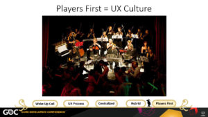
At EA we were all doing our dancing steps, but you truly dance when you go with the music. The director of the orchestra is a key piece pull us all together. You need leaders in your organization who also believe in UX who will support those efforts. For instance from providing more resources to including UX insights into the bigger picture of the business.
In 2013, Andrew Wilson became the CEO of EA. As the new leader of the Company, he set a series of pillars for guiding EA. His most important pillar is: Players First. Bringing gamers to the forefront of making games is a commitment to user-centered design. It’s pretty much saying UX First!
The whole company was excited about this. I personally was thrilled! It was the natural harmonization of the grassroots and top down efforts. Nowadays, there is no discussion about how good a game is without taking about players insights.
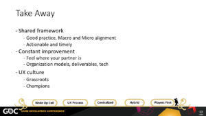
And that has been our journey about UX at EA. Recapping the lessons learnt that I shared here:
- Shared framework
- You need good research practice that is effective and communicates clearly
- Set a common map and know each others’ steps at a macro and micro alignment
- Always make sure your findings are actionable and timely
- Constant improvement
- Feel where your partner is, and adjust accordingly, leverage on opportunities
- Find a organization model that fits your company needs
- Continue reviewing and evolve your deliverables and technology supporting your work
- UX culture
- It needs both dancers and music for the UX culture to truly thrive
- Identify work with both those in the grassroots and executive champions
